MERGE SYSTEM
Redesigning the Merge System in TVMan for Media-press.tv
MERGE: STREAMLIND, SIMPLIFY, SUCCEED
Background
I undertook the challenge of redesigning the merge system within TVMan, our proprietary tool for managing television content. The existing system was outdated and inefficient, hindering the productivity of our redactors. This case study outlines my journey through the redesign process, highlighting the challenges faced, strategies employed, and solutions implemented.
Problem
The previous merge system was cluttered and inefficient, with critical information buried under irrelevant data, leading to excessive scrolling and reduced productivity. The field arrangement did not align with the Broadcast Preview, causing confusion and increasing the likelihood of errors. Unused fields cluttered the interface, and redactors lacked the ability to customize their workspace by hiding irrelevant fields or reordering information. Additionally, the system did not provide clear feedback on auto-merged content, leaving users uncertain about the accuracy of merges
Project Goals
he redesign aimed to:
Enhance Interface Clarity and Usability: Streamline the merging process by decluttering the interface, prioritizing critical information, and reducing excessive scrolling.
Align Field Arrangement with User Expectations: Reorganize the field structure to match the Broadcast Preview, ensuring a logical and intuitive workflow that minimizes errors.
Implement Customization Features: Introduce functionalities allowing redactors to hide irrelevant fields and reorder information, enabling a personalized and efficient user experience.
Provide Clear System Feedback: Develop mechanisms offering immediate and transparent feedback on auto-merged content, enhancing user confidence in the system’s accuracy.
01 / Empathize - Exploring & Researching the User's Needs
Overview
The project focused on redesigning the Merge system within the TVMan platform used by Media-press.tv, addressing issues faced by redactors during content merging.
Research Approach
To clearly understand user needs, the research included:
User interviews with head redactors.
System analysis of current workflows and pain points.
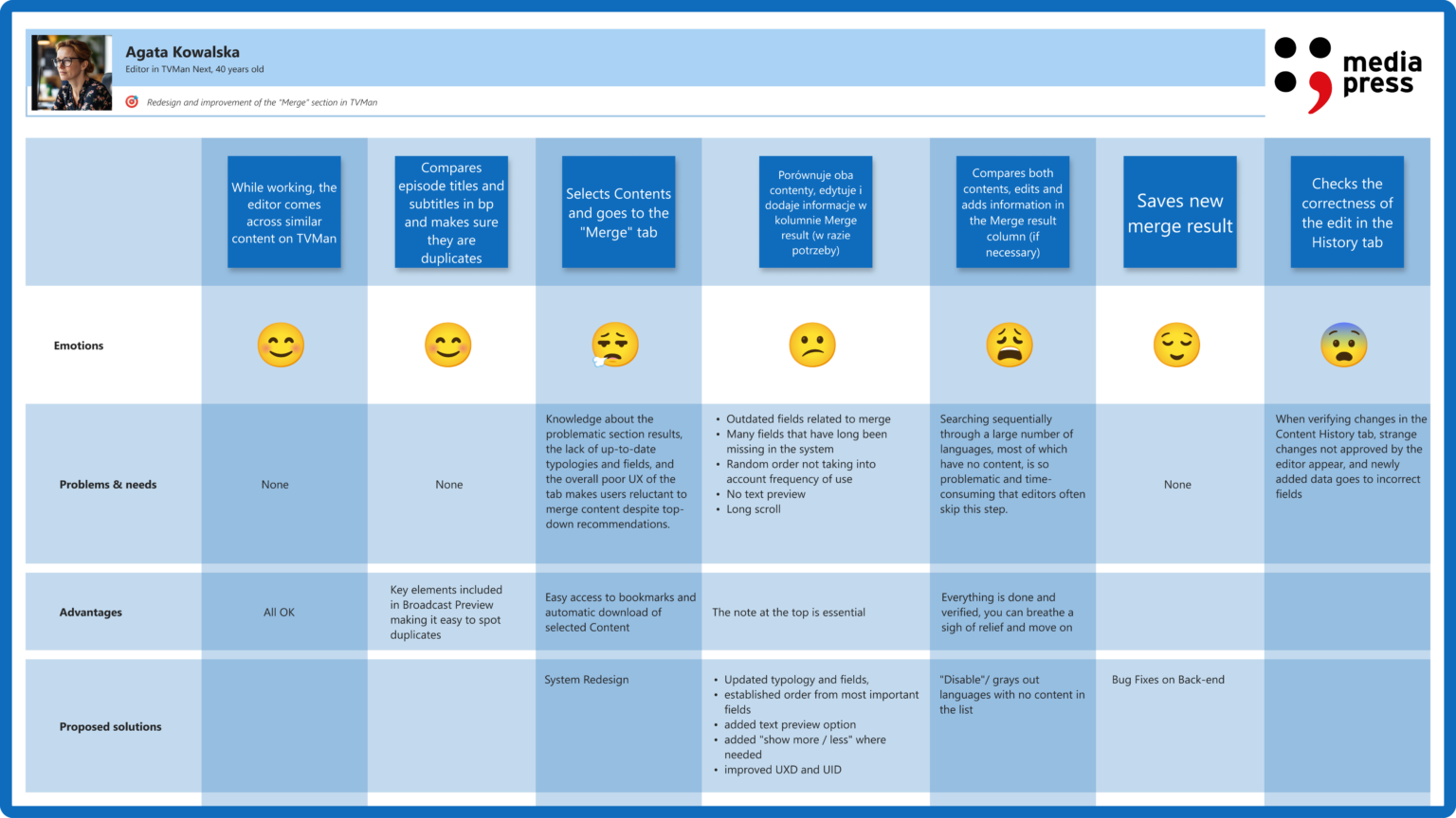
User journey mapping to visualize and identify bottlenecks.
Goals of the Research
My objectives were to identify the primary challenges in the current merge system, understand the information hierarchy and workflow preferences of redactors, and gather requirements for features that would enhance efficiency and user satisfaction.
Key Insights from User Research
The research revealed several critical issues:
Critical data was buried under less relevant information, leading to excessive scrolling and reduced efficiency.
The structure of fields did not align with the Broadcast Preview, causing confusion and errors.
Unused fields cluttered the interface, distracting users from essential tasks.
Redactors desired the ability to hide irrelevant fields and reorder information to suit their workflow.
The system did not provide clear feedback on auto-merged content, leaving users uncertain about the accuracy of merges.
02 / Define - Establishing the User's Needs and Problems
Overview
Synthesizing my research findings allowed me to define the core problems and user needs, guiding the direction of the redesign.
Empathy Map Synthesis
I developed an empathy map to encapsulate redactors’ experiences, highlighting their frustrations with excessive scrolling, the desire for a system that adapts to their workflow, feelings of frustration with inefficiencies, and the creation of workarounds to manage clutter.
The key problems where:
“I spend too much time scrolling through irrelevant fields.”
“Important notes are buried under unnecessary information.”
“I often struggle to verify if the data is correctly auto-merged.”
“I need to easily reorder fields to match my workflow.”
Persona Development
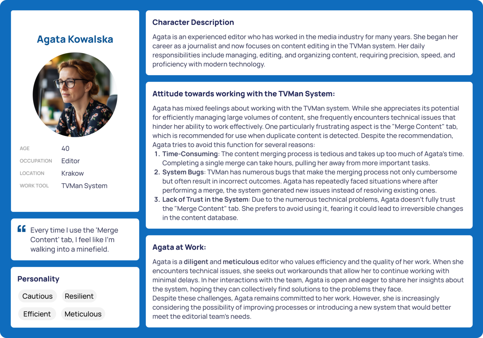
Created a primary user persona based on insights: Anna Kowalski, a head redactor who needs efficient merging to streamline content accuracy.
Meet Anna, the Efficiency-Focused Redactor:
Values quick access to crucial merging information.
Needs clear visibility and feedback for verifying merges.
Prefers customizable views and easy-to-navigate layouts.
How might we create a seamless and efficient merge experience for redactors?
03 / Ideate - Creating the Framework
Overview
With a clear understanding of user needs, I brainstormed and conceptualized features to address the identified challenges.
Feature Roadmap
Key features prioritized for the redesign included:
- Maintaining a table format while enhancing clarity and usability,
- Aligning the design with the overall system for consistency,
- Displaying matching percentages per language to assist redactors in making informed decisions,
- Allowing users to hide empty fields and correctly merged fields to reduce on-screen clutter,
- Enabling flexible adjustments to match individual workflows,
- Ensuring key exception notes appear prominently,
- Introducing content search and add options along with toggle buttons for row visibility,
- Relocating the language panel to the left with a dropdown selector for better accessibility,
- Preventing incorrect content merges through clear alerts, and tracking keyword usage for better content management.
04 / Prototype - Bringing the Design to Life
Overview
The UI leveraged Fluent React v9 library components, focusing solely on UX optimization. Additionally, to aid team collaboration, I converted the Fluent React v9 components into a comprehensive Figma library, simplifying design workflows.
Sketches & Wireframes
Initial sketches and wireframes focused on designing an intuitive layout that simplifies access to various features, highlighting essential information such as critical notes and alerts, and integrating features like drag-and-drop reordering and visibility toggles seamlessly.
Fluent UI & UX Integration
Utilized Fluent React v9 for UI consistency, ensuring visual alignment with existing systems while significantly enhancing user experience.
Final Design Features
Redesigned Merge Panel: Clearly displays language-specific matching percentages.
Visibility Toggles: Allow hiding of empty or correctly merged fields.
Drag-and-Drop: Reordering functionality for user customization.
Enhanced Notes Visibility: Exception notes prioritized at the top.
Language Panel: Redesigned panel placed to the left with dropdown selectors and clear percentage displays.
Merge Restriction Notice: Prevented incorrect merges proactively.
Keyword Counter: Provided insights into keyword usage for better management.
05 / Test - Validating the Prototype
Overview
Usability testing was conducted to gather feedback on the prototype, assess its effectiveness in addressing user needs, and identify areas for improvement.
Usability Test Plan
Participants from the initial interview phase were invited to interact with the prototype, performing tasks such as navigating the merge interface to complete a content merge.
Usability Test Objectives:
Assess clarity of navigation.
Evaluate effectiveness of visibility toggles and merge feedback.
Identify potential usability issues in reordering and language panels.
Usability Test Findings
All participants successfully navigated the new design and completed tasks more rapidly than before.
Key insights:
Visibility toggles significantly reduced scrolling time.
Merge feedback (matching percentages) provided valuable immediate verification.
Drag-and-drop improved workflow customization, though some minor tweaks were needed for smoother interactions.
Priority Revisions
Based on the findings, I prioritized enhancing system feedback mechanisms to provide clear confirmations of successful merges and alerts for potential issues, further refining the user interface to improve intuitiveness and reduce cognitive load, and expanding customization options to allow users to save personalized layouts and settings.
Reflections & Learnings
Key Takeaways
Based on the findings, I prioritized enhancing system feedback mechanisms to provide clear confirmations of successful merges and alerts for potential issues, further refining the user interface to improve intuitiveness and reduce cognitive load, and expanding customization options to allow users to save personalized layouts and settings.
Future Improvements
Based on the findings, I prioritized enhancing system feedback mechanisms to provide clear confirmations of successful merges and alerts for potential issues, further refining the user interface to improve intuitiveness and reduce cognitive load, and expanding customization options to allow users to save personalized layouts and settings.
Final Thoughts
This Merge UI & UX redesign significantly improved redactors’ workflow, emphasizing usability, hierarchical clarity, and powerful customization options. The project underlined the importance of research-driven design, iterative testing, and effective collaboration.


