
Hubert CMS Web App
Reimagined Workspace for Productive Flow
Structure, Speed, and Clarity—Redesigned.
Background
This project focused on overhauling the UX of a complex internal workspace application built on the Hubert CMS. While the UI components were based on the Hubert Design System and the Kendo UI Library, the app’s experience had grown inconsistent and inefficient due to accumulated features and scattered workflows. The challenge was to restructure the user experience, making key actions more intuitive and accessible while retaining the system’s powerful functionality.
Problem
Users frequently reported frustration with buried actions, hard-to-find filters, and inconsistent navigation patterns. The left sidebar lacked structure, and filters—critical to data management—were difficult to discover and configure. As the platform scaled, workflows became cluttered and unintuitive, reducing user productivity.
Project Goals
Reorganize the UI to align with users’ daily workflows
Centralize key actions for faster access and fewer clicks
Improve visibility and usability of filters and advanced queries
Introduce a smart AI assistant to aid content-related tasks
Enhance overall consistency and accessibility across the workspace
01 / Empathize - Exploring & Researching the User's Needs
Overview
To build a streamlined, intuitive workspace that would improve user efficiency and reduce friction in daily operations, I started by understanding the challenges faced by users in previous versions of the app. I reviewed existing pain points related to navigation, task execution, and feature discoverability.
Research Approach
Since this was an internal project and I was working solo, I conducted informal interviews with team members, product owners, and a few long-time users. These conversations provided qualitative insights into what frustrated users, what they wished was simpler, and what they loved about the tool. Additionally, I explored how comparable workspace and CMS platforms structured navigation and core workflows.
Key Goals of the Research:
Improve task efficiency and minimize unnecessary clicks
Reorganize essential tools to improve discoverability
Reimagine filters and data handling for power users
Competitive Analysis
While Hubert CMS is custom, I reviewed tools like Notion, Airtable, and ClickUp to gather insights on clean interfaces, layout organization, and task-focused workflows. These platforms served as inspiration for reducing visual clutter and emphasizing user actions.
Customer Interviews
Insights from redaction members highlighted several issues:
Key actions like Save or Export were buried in dropdowns
Filters and advanced queries were hard to find and manage
The sidebar was inconsistent and distracting
Users struggled to monitor changes across records efficiently
They wanted better language switching and smarter alerts
02 / Define - Establishing the User's Needs and Problems
Overview
Using the feedback and insights gathered, I developed user needs, refined personas, and mapped challenges.
Empathy Map Synthesis
From the research, it became clear that the interface needed to surface essential tools, reduce friction in navigation, and improve the data filtering experience. Though I didn’t formally develop personas, I continuously referenced real comments and behaviors from internal users to ground my design decisions.
Statements like “I just want to click less“, or “I didn’t even know that tab was active” informed the main pain points I addressed: too many steps to accomplish simple tasks, hidden or inconsistent UI elements, and a lack of clarity about system state.
03 / Ideate - Creating the Framework
Overview
Once the goals were clear, I focused on reshaping the UX using ready-made UI components from the Hubert Design System and Kendo UI Library, with enhancements where the libraries were limited.
Task Flow
The restructuring began with mapping real user flows—saving records, applying filters, switching views, exporting data. I reshaped these paths around clarity and ease of use.
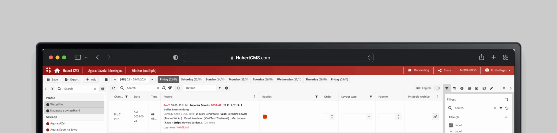
The top toolbar became home to primary actions: Save, Export, Add, and access to the Calendar. This reduced the need for digging through nested menus.
The right-hand panel was transformed into a multi-tab control hub, now housing Advanced Filters, Modifications, Layout Settings, and more. Filters, which were previously hidden, were surfaced in a tab that flashes briefly the first time it appears—a subtle guide for new users.
The sidebar was simplified and standardized, making it collapsible and easier to scan.
To assist with writing-heavy tasks, I introduced Tola, a right-side AI assistant panel that helps users summarize, translate, paraphrase, or proofread content—improving output quality while saving time.
I used the existing Hubert Design System and Kendo Library to ensure visual consistency. When those libraries proved limited, I designed components myself and rewrote them into a shared Figma UI kit for my team, which greatly accelerated project development.
04 / Prototype - Bringing the Design to Life
Overview
I used the Hubert and Kendo UI libraries to ensure consistency. Since these libraries had limitations, I designed some components myself and rewrote the component library into a Figma system to support my team.
Final Design
I created internal sketches and wireframes based on the revised structure. These included:
The updated top toolbar
The right-hand control tabs
The redesigned sidebar
Once the wireframes were internally reviewed, I translated them into high-fidelity mockups using the Figma kit I built from Hubert and Kendo UI components.
The result was a highly functional prototype that could be shared, tested, and refined collaboratively.
05 / Test - Validating the Prototype
Overview
Streamlined user flows ensured easy navigation between finding routes, engaging socially, tracking climbing progress, and accessing safety features.
Usability Test Plan
To validate the changes, I conducted user tests with five internal stakeholders. I guided them through common tasks: saving records, adjusting filters, modifying data, and navigating views.
Usability Test Findings
All participants found the new top toolbar intuitive and helpful. Four out of five users appreciated the blinking filter tab for drawing attention to the new structure. The revamped right panel tabs made switching tasks clearer. The language switcher and smart alerts also received positive feedback.
Priority Revisions
Following testing, I made a few small refinements: turning off blinking filters after first use, improving contrast in the sidebar, and simplifying some icons in the layout tab.